ZEEMAN
Clear and organized
ZEEMAN as a brand has gone through a development lately and that is now reflected by the stores as well. The existing customers still have to feel at home, but ZEEMAN also wants to be of better service to new customers. By doing so, they maintain their low price positioning and like to keep things “SIMPLE”.
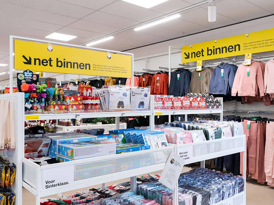
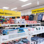
The first striking things are the clear, yet warm lighting and the white furniture. It gives the store a clear and organized look. Yellow accents set the tone; the colour red is disappearing from all store communication – unless it is meant for offers and promotions. Those are rare at Zeeman, however, as it has a strategy of low pricing every day.
